With the ExpoBadge products you are able to print your event badges live in full-color. Besides the most obvious advantages like no more preprinted media and low costs for smaller events, there are many more possibilities than just live full-color printing with a logo of the event. To get the most out of the possibilities of a live printed full-color badge, the lay-out of the badge is key.
Communicate with colors
That live full color ExpoBadging makes it possible to print an event logo is obvious. Also a nice looking background color or even a background design is pretty straight forward. Some even print a photo of the badge owner on the badge, to be honest I don’t see the benefit of that, since you can see the face of the badge owner as he or she walks by, but it can and is being be done.
But to take a badge design to the next level and make optimal use of the possibilities that live full-color ExpoBadging offers, you should start with communicating with colors. But what can be communicated with colors? Here is a quick list of the most common and easy to use ways. Each point will be explained in this post.
1. Visitor type
2. Visitor permissions
3. Visitor company logo
4. Visitor private agenda
5. Badge-advertising
 Visitor type and permissions
In almost all events there are various visitors. For example, expositions have the exhibitors and visitors and for a congress you have the visitors, speakers and waiters. In real life there are many more but for now this makes the point. And again, not all visitors are the same, some have extra permissions or benefits like free drinks or entrance to event extra’s and backstage areas.
When printing black on white you can only say this in words or have several check-in lines for the various visitors using preprinted colors. Very annoying when your VIP is finally at the check-in just to hear he was waiting in the wrong line.
When using live full-color ExpoBadging solutions you can easily communicate all this in a color on the badge and still use a single line check-in solution, no need to separate the visitors in to predefined check-in lines. Also the number of used colors is basically unlimited. But what is the best way to communicate this?
In our opinion the best way to communicate this info is using a bright color bar at the bottom of the badge with a bold font type in white. Whit using a bright color the visitor type can easily be recognized from a distance, the description in white is just as a reminder in case someone doesn’t remember or yet knows the color types.
When the badge is being worn whit a key cord around the neck you should consider the possibility that it can turn around while wearing it, in that case you should print this colored bar on both sides of the badge.
Visitor company logo
In some cases it can be a benefit to print a company logo on the badge, not the logo of the organization or event, but the company logo of the badge wearer. This creates a quick recognition of the badge wearers company. The benefit of printing this company logo on the badge is the fact that it can create an easy start of an conversation or a quick identification of interest to speak to (or the lack on interest to avoid wasting time with a useless conversation????).
To avoid using a magnifying glass to see the logo you should make sure its printed big enough to recognize from a small distance but not so big that is distracting. Don’t forget that company logo’s come in all kind of sizes and shapes. The best way to place the logo correct is to create a border that fits several types of logo shapes and use an auto scale in the design software to fit all logo’s whit inn the predefined borders. Obviously you should avoid a background color in the design of the badge where the logo will be printed.
 Visitor private agenda
Using the rear side of the badge offers you the possibility of printing a private agenda or schedule. Just like printing black on white you can easily print several variables that match the visitors personal event agenda. But by using colors as background or even colored letters (or a combination of both) you can highlight some parts of the agenda that are important or even obligated for the visitor, or important for the event organization.
An much more easy and more used possibility is using 2 slightly different light colors as background per row so the schedule is more clear and easy readable.
Badge-advertising
Not all events use this but it can be a big money maker in some cases, advertising on the event badges. When doing this you should always use a bigger sized badges like the ExpoBadge 260 or 260T. The smaller badges like the ExpoBadge 260S will not give enough space to create a good looking color badge that leaves space for badge-advertising.
Badge-advertising is nowadays mostly used on preprinted badges, In those cases all badges have the same or maybe 2 different ads on it. But what if you can have more different ads on it that directly reflect on the interested of the badge owner?
Whit live full color ExpoBadging this can easily be done. To do this you should already start working on it during the registration of the (potential) visitors. As everyone knows, especially when in marketing, the best ad is the ad that correspond with the interest and needs of the potential customer. To get this info you should implement a simple but obligated multiple-choice checkbox overview of market interests, product interests, working fields or other check boxes that will reflect on the potential ads that can be sold for the specific event.
By doing so you can easily select the correct ad for each visitor. This will increase the value of the advertising space big time. This increase of value will easily payback the investment of the needed Epson ColorWorks TM-C3500 printers. After earning back the investment the badge-advertising will make you money like never before.
 The complete badge lay-out
The best lay-out for all badges doesn’t exist but there are a few basics to consider when making the design of the badge. You have to select the variables you want to print and the color you want to use. This variates per event, number of visitors and so on. When you know what you want to print you can start working on the lay-out placing all variable fields and the basic design, or designs if you want different badges for all kind of visitors. Here are some basic rules or guidelines to consider when making the final design:
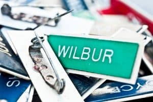 1. The name on the badge should be big enough to be easily readable for a good distance. In my opinion a font size of at least 18 should be used. If this doesn’t fit you can also say, depending on the event and crowd type, to print the first name large and print the last name beneath this in a smaller font. Keep in mind that some have long names and some short.
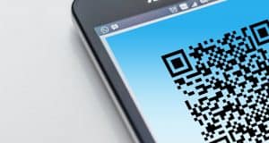 2. A QR-code or barcode should only be printed when really necessary. A QR-code for instance can be used for quickly handing over contact details or website links but not everyone is waiting for that and not everyone has a QR scanner app on their phone. Also a QR code can distract the attention away for the personal contact and conversation. On the other hand it can help with exchanging contact details after a good conversation.
 3. Use a badge size that is both nice to wear as offers enough space to print all needed info. A to large badge won’t have a nice look and will leave to much space blanc. A badge that is to small will result in a lack of space to print all needed info and pictures leaving no space for a nice design and will unavoidable lead to an unreadable and unpleasant badge.
 4. Take your time to select and match all colors that will be printed. Do this to avoid using a background color that matches to much with the visitor type color or a background color that makes the names hard to read. Also compare the different badge types for visitor types and make sure the visitor type colors are different enough to be separated from a distance.
5. Last but not least, create a nice looking background that reflects the setting of the event. Don’t use a background that doesn’t fit the event or a background that will distract from the info and/or person that is most important, your visitor and its information.
Questions or remarks?
Ask questions to get answers
You should now have a basic idea about creating the best badge layout and making an optimal use of the possibilities that live full-color ExpoBadging offers. More and more event organizations and customers will be asking for live full-color printing of badges. I would suggest to be ready to offer them just a bit more by guiding them to the best lay-out so they will have that WOW effect of your service. What some lay-out examples? Just send me a mail and we will send you some.
As stated before in my English posts, but again as a small reminder. “I’m dyslectic and Dutch is my first language, the article could have some typing errors. So, for this I apologize in advance, but please remember, it is the message that counts, not the way it’s written.”
ExpoBadge is a solution created and owned by Smart2B B.V. in the Netherlands. Smart2B is an GOLD-partner of Epson ColorWorks and not an Event organization or software company. Smart2B concentrates on selling Epson ColorWorks inkjet label printers and needed print media such as the ExpoBadge products. We work with several partners and users around the world. Please feel free to contact me with all questions or if you are looking for a ExpoBadge offering badge organization.
Smart2B B.V. – ivar@smart2B.nl – +31 318 590 212 – The Netherlands

